
Edmonds Historical Museum / Capstone Project
AI-Assisted Video Clipping Tool
Helping curators clip and shape engaging stories

PROJECT BRIEF
Collaborating with Edmonds Historical Museum (EHM), I led the design of an AI-assisted video clipping tool that enables curators effectively turning long oral history videos into short, context-rich clips. This helped the museum share more archive stories with the public in an engaging way while reducing curators’ editing workload.
MY ROLE
UX Design, Visual Design, User Testing
WITH
1 Designer
TOOLS
Figma
CONSTRAINTS
Less Tech-Savvy Users
IMPACT
Delivered an interactive demo and implementation guide that strengthened the museum's grant application and reached high client satisfaction.
PROBLEM
Curators in small museums had no time or easy tools to turn hours of oral history videos into short clips while keeping the narratives.
Oral history interviews are often hours long and contain rich context and personal narratives. However, most of this content stays buried in museum archives, largely because curators struggle to edit clips while retaining narrative flow and historical integrity within limited time.

Oral history videos from EHM's archieve
SOLUTION
Make context-rich story easy: An AI-assisted video clipping tool for curators
01
Find themes faster, with reasoning
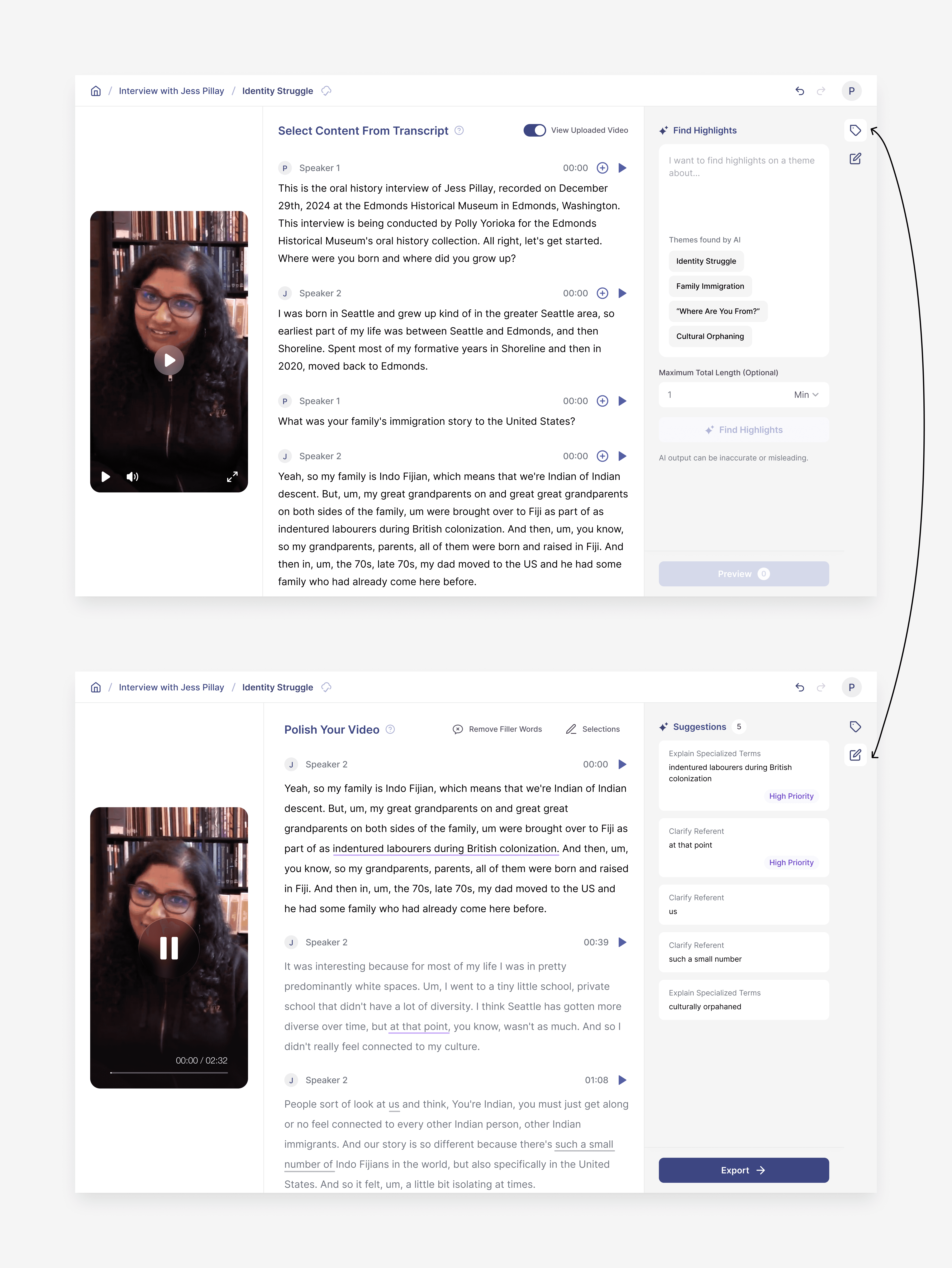
After uploading a video, curators begin in a transcript view, where they can skim and select segments with help from AI surfacing segments around curator-defined themes
This makes it faster to spot relevant content without losing trust or control.
Polish clips into a cohesive story
Curators polish the selected clips with support from narrative-aware AI suggestions, making the final video audience-ready.
Edit selected content anytime
Curators can revisit any chosen clips at any point to delete, add or adjust, giving them flexibility to refine the story structure as they go.
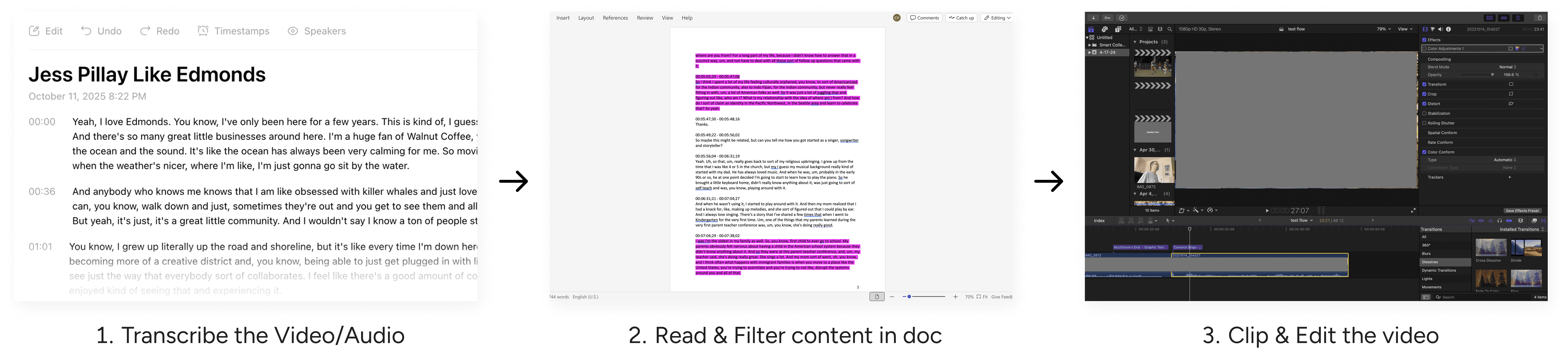
Museum leadership are interested in “How AI can support curators in video making process”
Pain points & Opportunities
By talking to users and conducting user journey walkthrough ourselves, here are some key findings in the process.
⏰
Time consuming in selecting content
Curators begin with a theme in mind, and scan transcripts back and forth for content
Opportunity 01:
Theme Discovery
Helping curators find relevant content faster and more transparent
🫥
Loss of narrative after selecting
Context often gets lost when manually clipping, making stories feel fragmented
Opportunity 02:
Story Refinement
Helping curators preserve storytelling context and narrative flow in final outputs
⛓️💥
Disconnected tools
Existing tools are spread across platforms and too complex for non-technical users
🤖
Low AI familiarity
AI is intriguing, but curators are unfamiliar and only let it transcribe the video/audio
Opportunity 03:
Overall
A product that is trustable and has low learning curve
Success Criteria
01
Ease of use
Easy to navigate and understand for non-technical user
02
Trust of AI
Build features that are transparent, explainable, and always under curator control
ITERATION
ITERATION
ITERATION
ITERATION
ITERATION 1: OVERALL FLOW
How to make the product easy to learn?
One step (tab) vs two steps (separate pages)
At first, I debated whether to follow competitors with one-step editing flow or design a two-step process that mirrored curators’ existing habits. After user testing, we saw that splitting steps reduced cognitive overload making navigation feel easier and more natural.
ONE Step
Some are cognitive overload by having transcript, video, and editing tools on one screen.

Two Steps
This matched how curators naturally move through tasks allowing them focus on transcript review first, then narrative building, without feeling rushed.
ITERATION 2: AI INVOLVEMENT IN THEME DISCOVERY
How to balance the involvement of AI so it's helpful but still trustable?
Different levels of AI involvement:
Multi-turn search vs Single-turn search
In the first step, we explored different levels of AI involvement, including a multi-turn dialogue vs. a single-turn search bar with more user autonomy. After testing, we found that users preferred a simpler approach.
MULTI-TURN
Most reflected they are not comfortable using this chat bot AI, makes them feel like giving away control.
SINGLE-TURN
We turned it into single-turn based on user feedback, surfacing themes upfront to lower the learning curve.
Adding AI reasoning
Users didn’t just want suggestions, they wanted to understand why a clip is suggested and how AI understand their ask, so I introduced a card that briefly explains why a clip was chosen. This addition made a big difference in transparency and trust.

ITERATION 3: LAYOUT OF AI ASSISTANT
Where should we place the AI assistant to let it better assist users?
Horizontal vs Vertical
Before we jump into vertical layout, I also tried horizontal layout.
However, I found that the horizontal bar is not scalable for more contents and will cause inconsistent layout pattern in the second page. Also having it on the right (vertical) give more scanning space and also clean if they want to ignore.
Before: horizontal
Users felt the scan space was too small. They wanted a less intrusive interface.
After: VERTICAL
We adjusted the layout to ensure the expandability and readability.
ITERATION 4: AI INVOLVEMENT IN STORY REFINEMENT
How should we surface AI suggestion that gives users control?
Preview card: Progressice Disclosure
In the second step, we use AI to identify contextual information loss and surface it to users. Inspired by Grammarly, I grouped AI suggestions and displayed solutions upfront, assuming it would speed up edits for users. However, it isn't the case.
Before
Users didn't like the action suggestion and the upfront AI solution. They wanted more assisting than telling them what to do.
After
We added higher-level suggestion and disclosed AI suggestion in progressively in second layer. Giving back control to users
ITERATION 5: REFINE INTERACTION
How to make the interface interaction more intuitive for non tech savvy users?
Refining micro-interactions in video editing
During the design process, I also led several detailed refinements to make the tool feel more intuitive. An example was to improve the interaction of how users see and adjust overlay lengths within the text editing zone. I played with different styles and after conducting 5 guerrilla testings with non-technical users, we went with the version that was visually the least distracting.
IMPACT
Empowering curators and helping the museum secure funding.
What we delivered and received…
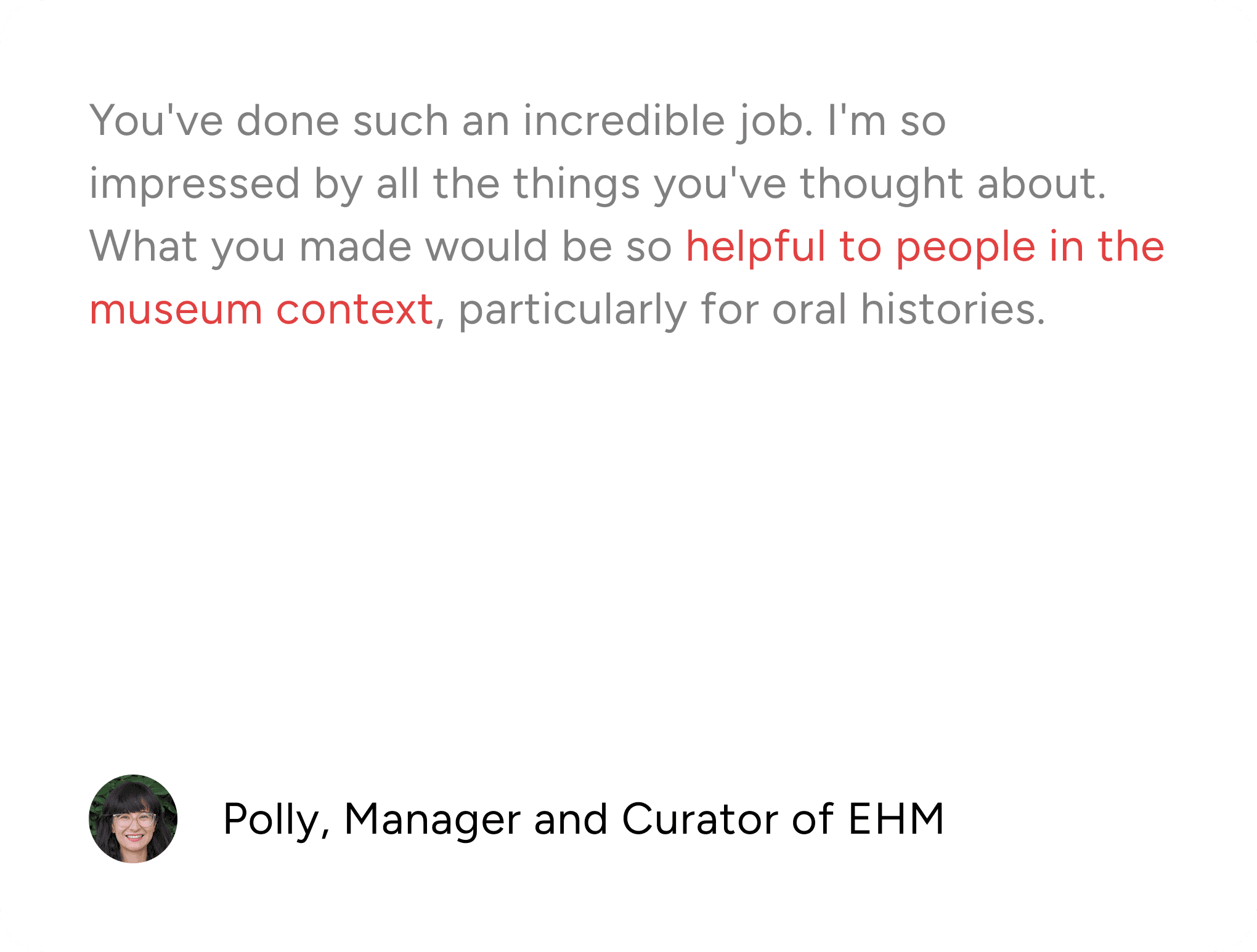
The project earned strong recognition from EHM’s leadership for its innovation and potential to scale across small museums. Our delivery of an interactive demo, design toolkit, and implementation guide also strengthened the museum’s grant application.

If having resources to develop it further, our success metrics could be…
QUANTITIVE
Viewer engagement
Track changes in view times on YouTube (where EHM publishes final videos) and onsite in the museum after adopting the tool
QUANTITIVE
Curator efficiency
Compare curator-reported workload producing audience-friendly video clips before and after using the tool
LEARNING
Designing with AI means prioritizing trust, control, and clarity—while staying adaptable to constraints.
Trust is emotional, not just technical
Even when AI works “accurately,” users may hesitate to accept it. Designing for trust means accounting for feelings of control, not only correctness.
Transparency Builds Confidence
Black-box AI erodes adoption. Showing why AI made a suggestion, and letting users adjust or override it, turns skepticism into confidence and collaboration.
Mirror Mental Models, Not Industry Standards
Following competitor patterns can clash with user workflows. Instead, design around how people already think and work — even if that means breaking from the “expected” UI.